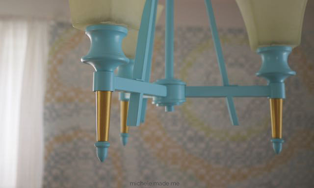
I never liked it anyway. For years, I never liked it. And for years I thought to myself: “If I spray-painted the darn thing, what could it hurt?”
So, guess what?
I finally did it and I’m glad I finally did it. It’s much prettier in blue with a touch of gold!
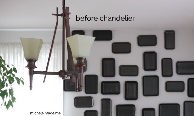
You see? This is what it looked like before…
It’s a much happier thing now! And so am I.
♥︎M


Ooh! I love the blue and gold together. So pretty!
Well, thank you! I like it too. 🙂
What an unusual lamp. It does look better in blue. My sister who likes mid-century modern ( as well as blues and greens) would just love this. It has a real contemporary feel now that it has been painted. I'll def. send her the link.
You're right, Lisa, it kinda does have that sorta mid-century vibe with the simple lines and all. I hadn't really thought of that. Makes me like it even more. 🙂
It's beautiful. I love it!
Thanks Brechtje!
Looks great! Good for you 🙂
Cant believe how much nicer that looks in blue!
A great transformation : )
thanks Linda and liniecat!
I like the AFTER!!
Ya, me too!
Wow Michele, It really looks awesome! Blue is refreshing indeed. I liked the black wall art behind. What is that? Big sized Marbles?
The black wall art behind the Before chandelier is made of recycled foam trays, hee hee. More pictures here:
http://www.michelemademe.com/2013/11/Foam-Tray-Wall-Decor.html