All this week we’ve learned some handy photography tricks from the contributors to the “Take Better Tutorial Photos Blog Hop”. Today’s post is my offering, and the last in the series. To view the entire series, explore the thumbnails at the bottom of this post.
So you’ve designed a craft, made the thing, and created a wondrous step-by-step tutorial so that others can make it too. It’s time now to make sure that all those hours of effort will not go to waste. It’s time to take…
The Beauty Shot.
Tips for Taking Beauty Shots with Michele Made Me
What is a beauty shot, you ask? Well, essentially a beauty shot is a beautiful photograph of your completed craft. It is the photo that entices us visual-types to explore more deeply a product, a tutorial, a blog, a website. It is the photo that people talk about. It is the photo that others link to. It is the photo that shows how much love you put into your craft. It is the photo that motivates your reader to make that craft herself.
 |
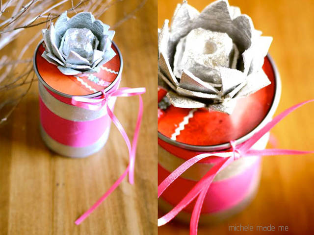
| Juicy Little Gift Box beauty shot |
Apart from the obvious pre-requisite of ALWAYS TAKING YOUR PHOTOS IN GOOD LIGHT, there are a few tricks I consistently use to make my finished crafts look their very best. And while I am not a professional photographer, these tricks have really worked for me.
1. Take MANY photos. The more photos you take, the better you get at taking them, and the more likely you are to snap some good ones. You’ll then be able to throw out the blurry ones, the overly dark ones, and the badly composed ones, and you’ll still have a nice selection to choose from.
 |
| Petite Purse Ornament matrix of many good and bad photos |
2. Take photos from a variety of angles. The photos of your craft tell a story: how it is made, what it is made of, how intricate it is, how much care went into it, how beautiful it is. Don’t be afraid to really get in there and experiment with low shots, high shots, shots of the back, side shots, extreme closeups, wide shots, and full frontals. This can be such an enjoyable process. Have fun with it!
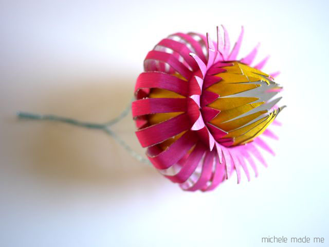
3. Keep the background simple. My all-time favourite and oft-used background is a clean white poster board. Its simplicity makes it obvious to the reader what the focus of the shot is. It is the ideal foil for most colours and textures, reflecting light like nobody’s business. Plus, it is clean! Let’s face it, when I don’t have time to clean my messy house for picture-taking, the clean white poster board is a godsend.
 |
| Closeup of TP Roll Thistle Ornament on plain white poster board |
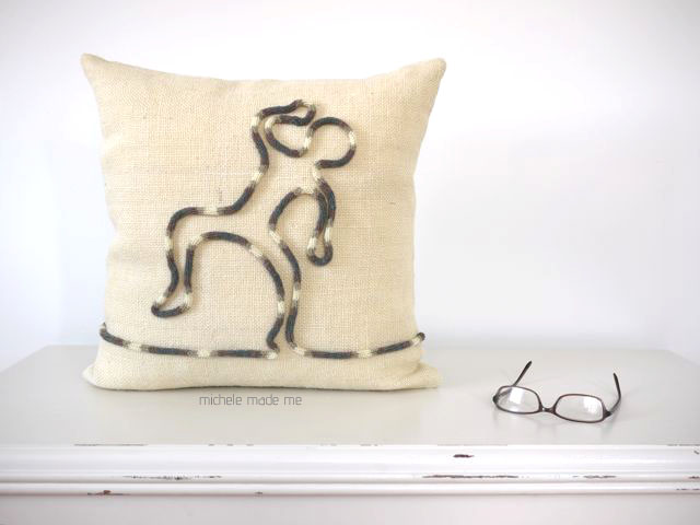
4. Keep the styling simple. A simple, minimalist arrangement can be achieved with the addition of one or two complementary props. For example, I will often throw some greenery or my glasses into a shot: greenery because it goes with everything, and my glasses because they add a personal touch to the photo without my having to be in it. Place the prop in the scene, move it around, and take shots of the various arrangements as you go. Finally, choose the shot that works best for you.
 |
| Corked Cushion with single prop |
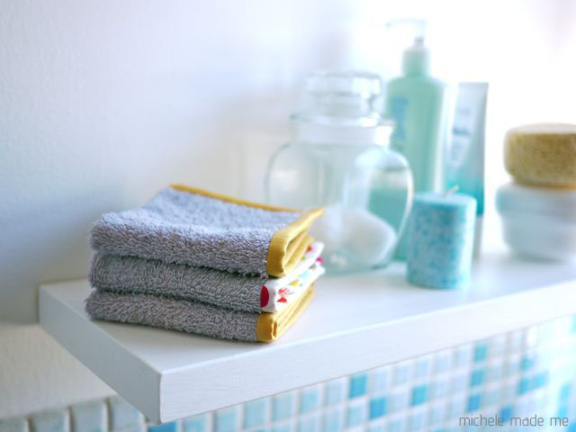
5. Put the craft in context. In other words, if you’ve sewn up a pretty pillow, stick it on your cozy couch. If you’ve made a garden marker, throw it in the garden amongst actual plants. Putting your product in context adds real warmth to a photo, but it also helps the reader imagine what the thing might look like in their own home (or garden) and might even nudge them into making one of their very own.
 |
| Old Towel New Washcloths in context in the bathroom |
6. Try something completely different. Use your imagination, and try something utterly unexpected with your beauty shots. I love surprises and I’m always impressed to witness a fellow creative going that extra mile with their product photography. The unexpected can be truly irresistible.
 |
| A bit of fun with Flying Slippers |
I’m not suggesting that you use every one of these tricks every time you take beauty shots. But, on occasion, do try using simple arrangements with props, or try going beyond just snapping a couple of quick photos when you’ve completed your craft. You’ll find the extra bit of effort breathes new life into the experience. Your tutorials will get noticed. And you’ll have a gorgeous record of the beautiful thing you made with your own two hands.
As previously mentioned, the “Take Better Tutorial Photos Blog Hop” was brought to you by Haley, Diane, Megan, Stacey and me over the last week. You will find all kinds of pertinent photography tips in each and every one of these posts. Click the thumbnails below to check them out!
Thanks for inviting me to join in the fun you guys. Let’s do it again sometime, eh?

I loved it! Thanks for sharing!
What a great post Michele!! Thanks for sharing it with us!!
Hello Michele,
Thanks for the great tips. It's so hard to get good pictures sometimes.
Big hug,
Giac
Great tips, Michele!
Such great tips! Thank you 🙂
I really appreciate these tips, Michele. I'm such a process-oriented crafter, by the time the making is over, I really have to force myself to focus on getting a good finished-item shot. Your point about taking lots of variations from all angles is well-taken. I so often see a picture in my head of how the beauty shot will look, and I tend to shoot to that picture. When in fact, the best photography is, as you put it, a process of discovery.
thanks heaps Michelle, I love to take photo's but not always happy with the results. I'm going to be using these tips:)
Really great tips for the beauty shot. I try to incorporate these principles too. Before I did, the photos were just awful. A simple white background is probably the biggest improvement I ever made. I think it really improved the traffic to my shop site.
That is right, I used to take many photos at different angles and then I would choose better photographs. I need to concentrate on other tips too, so I can give better look of my handicrafts.
This is a wonderful tutorial, Michele! I agree- plain white poster board is the best backdrop. However, you always do a fantastic job of switching it up and creating beautiful photographs! Well done!